‘Tis the season to question your life decisions. The liminal space between Christmas and New Year’s almost always sends people into a spiral. After a long holiday with family, you don’t want to go back to work! All the good movies are on TV. The sports are very good. There are five million chores to do, and even more activities. At the end of the long year, and staring down the beginning of winter, there is no better time to question every decision you’ve ever made.
And the easiest one to question, of course, is work. I did not travel for Christmas this year, but there is nothing more demoralizing than spending an emotionally exhausting time with your family, navigating the brutal, ridiculous holiday travel circuit (especially this year), and returning home to realize that you’ve spent your vacation days on that and now have to return back to work. What is the point of all this! Why do we work so much! We don’t even get that much out of it!
Now is the perfect time to dream of hanging out all day. Every day it is too sunny to work, or too gloomy to work, or too nice to work, or too brutally cold to work. But every day is the perfect day to hang out. Why not use a couple hours of company time to peruse Zillow and dream about moving someplace where you don’t have to worry about clocking in? Some place cheap enough that maybe you could live on making stuff, or doing stuff you like, and never have to learn how to like … run a point-of-sale system, never have to scale it for profit. It’s a beautiful dream.
That’s how reader Seth found this house. He says, “I found it because I daydream about escaping someplace cheap enough to support myself on my art, and never have to touch a computer for work again.” That’s relatable as hell, Seth!
This week’s house has something that I have never seen before on Zillow. Instead of a price, it says “Price Unknown.” This is very ominous already. The “Zestimate,” that silly little estimation that Zillow slaps on all of its houses, says $76,800. This is such a specific estimate that I cannot take it seriously. Ah, yes. The estimate for this house? Hmm. It’s probably $76,814.32. Ridiculous.
The reason this house’s price is unknown is because it is up for auction! My understanding of auctions as a concept is that they are something that presumably can get you a deal, but actually are a way for rich people to amuse themselves with a man who talks very fast and the reminder that they have enough money to throw around willy-nilly. Though it is unclear what kind of rich person would want to buy this house.
First off, it is located in Leon, Kansas. I looked this up, and Leon seems to be a suburb of Wichita. It is located 36 minutes east by highway. The population of Leon is 669. With us, we could make it 670! That’s fun I guess.
Here is the house:
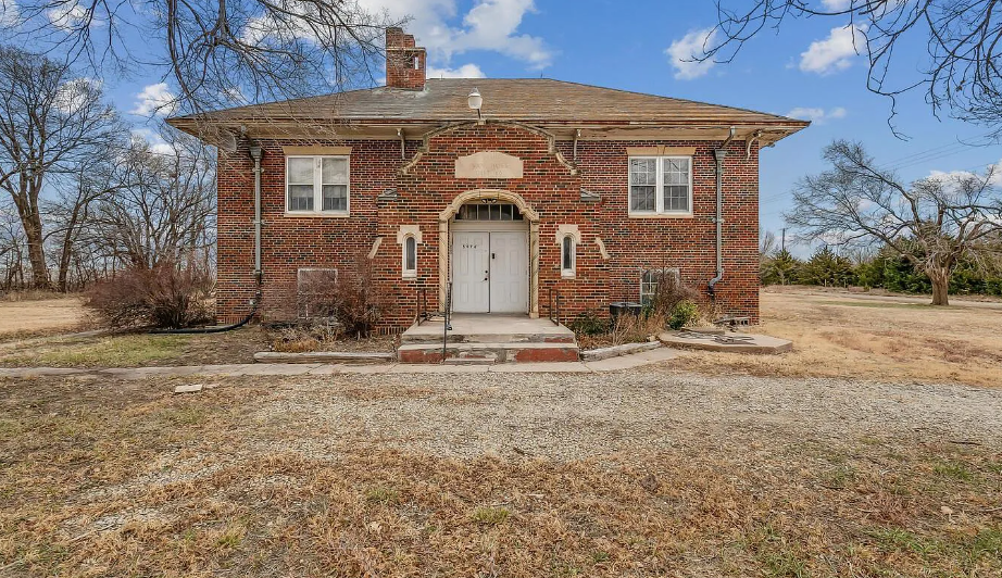
You might be thinking, Wow, this looks like a school. And you would be correct. This did used to be a school. It does not seem like a great sign for a town, to me, if you are auctioning off what used to be a school as a private family home. Did the children get a new school? Is school cancelled for kids now? Or are there just no kids left in Leon, Kansas? Where will they learn!?
Let’s walk around the back:
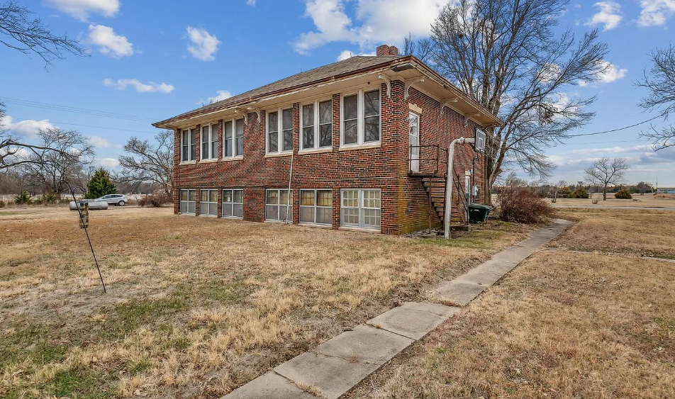
The double windows do scream school to me, but it makes sense that this is being listed as a single family home, kind of. It’s not that big. The Zillow listing clocks it at just under 1,500 square feet with three bedrooms and one bath.
Let’s go in the front door:
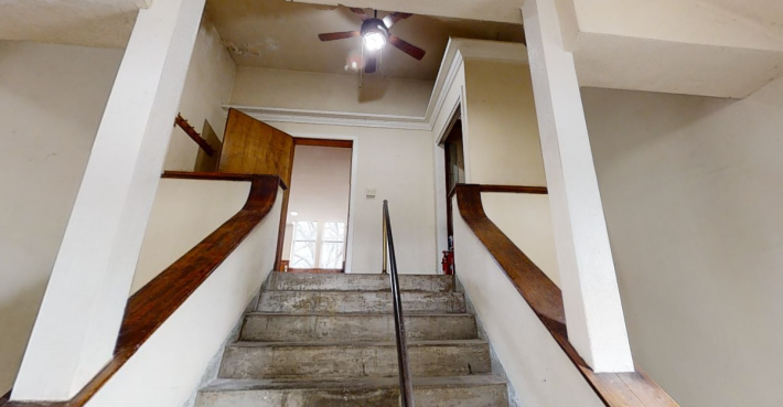
Hmm. OK. This layout does seem familiar for a school. We have one stairwell going up and two tiny stairwells on either side of it going down.
It’s a little weird to me to have the entrance to this school be on a landing when the school is on flat ground. From the photos, it looks like there is no slope 100 miles in any direction of this school. So why not open the front doors onto a regular floor?
My grandparents had a house on a hill when I was growing up where the front door opened onto a little landing and you had to choose your direction (up to the living room or down to the garage). I always picked down because that is where my grandmother had all of the Christmas barbies in their plastic prisons. So down we will go:
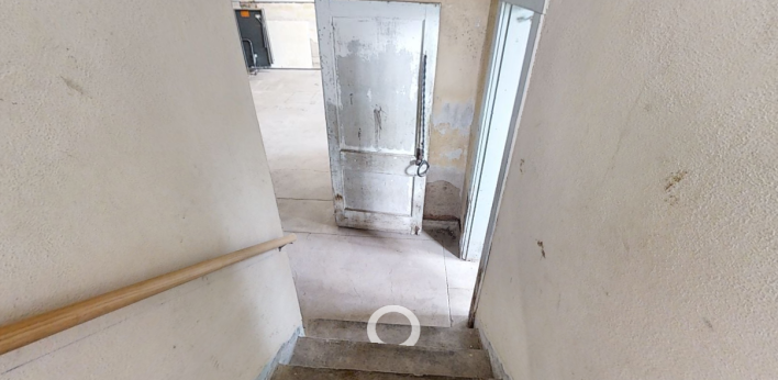
Immediately, I regret this choice. I took this screenshot from the 360 degree tour because it was very suspiciously not included in the stills.
What the fuck is that! Is that a pair of handcuffs tied up to the door? Are they attached to a chain? Who is being imprisoned on that door? That’s so scary! They are also just low enough that I guess a child could be locked up there, but what kind of trauma inducing punishment is that?
Let’s scoot right past this and into the door on the right:
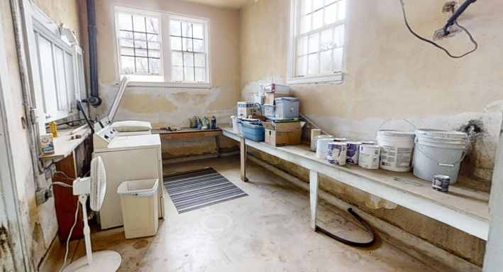
OK, all of this drywall needs to be replaced. It looks like someone did a half-hearted job at some point in the past, but it looks terrible, and it still seems to have some damage behind those very large tubs of concrete. I really hate the way that pipe and wire are coming out of the wall, too.
The light, though, is great. The benefit of the prairie is that the prairie has beautiful light. The sky is so big and there is nothing to stop it from streaming in. This does lead me to question why the stories of this school were built this way. I imagine in Kansas, in the winter, that much of those windows, which are at ground level, would be covered by snow. They also do not look very well-insulated so I assume the cold air would just stream through them! No thanks!
This little damaged room leads to a bigger damaged room:
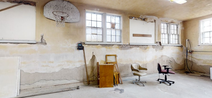
This seems ot be the room for activities. There is a basketball hoop, a piano, what seems to be an art easel, and two swivel chairs we could kick each other around in.
The walls in here are deteriorated in an aesthetic way, the kind of stripped plaster that you see in the nouveau riche’s farmhouse interior design. I don’t mind it, but again, it looks cold. Why is there this kind of cardboard hole in the middle of the wall? Is that supposed to be another window? I hate it down here.
On the 360 degree tour, if you try to exit this room through the door without the child handcuff on it, you end up in a very narrow hallway that leads to three different doors that you cannot go through. This gave me claustrophobia, so I did not take a picture. I closed the tab, and when I returned, decided to go through the handcuff door.
That, at least, leads us to a a door that is opened:
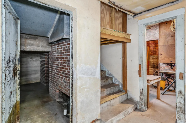
What it shows, though, is teeth-rattling. Why is this a steel door!? Why do those bricks look so clean down there? Probably that should be a janitor’s closet, but I’ve seen enough.
Seth, however, had different ideas. “The bomb shelter (how did I miss the heavy metal door on my first look through?!) under the stairs could be a very cozy reading room. Wing-back chair, rugs, lamps.” Now that he says it, I could see it! Imagine hanging lights from the ceiling in there. It could be nice, if we believe!
Thats enough! Up the stairs!
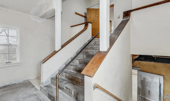
The other funny thing about these stairs, that I did not realize the first time, is that the handrail in the middle of the stairs is not actually in the middle. There is much more space to the left of it, than to the right.
Let’s scooch up the right side, and here we are in the … living room:
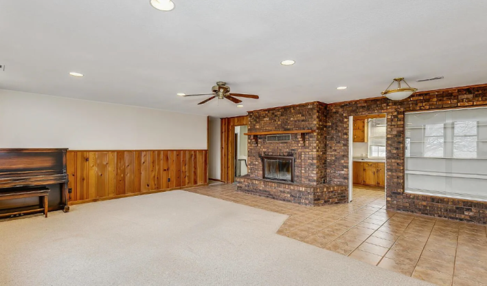
All right. We have another piano, which is nice, and I don’t hate this honey colored wooden siding that extends halfway up the wall. The bricks, I also don’t mind, and if you removed the glass from those built-in shelves, we could probably make this place feel much homier than it does now.
I hate, though, the divide. between the kitchen tiles and the carpet. That uneven line is the stuff of nightmares.
Let’s go in the kitchen:
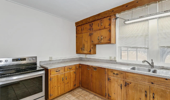
This is mostly fine. It’s not nice, and I can imagine the infinite crumbs that would fall between the counter and the stove, but this is nowhere near one of the worst kitchens we’ve seen. If you switched the tile floor, added a backsplash, and painted the counters, you could have something looking trendy in no time. That no one thought to do this does not particularly bode well.
This florescent light above the sink also looks poised to drop at any given minute. That’s scary. I do not like that.
“The light over the kitchen sink is particularly sad. It speaks to some kind of desperation and despair,” Seth said. “No one that did those remodels loved that place. Or if they did, there was no time or money to show that.”
That is the most glaring part of the upstairs here: the lack of care. For a house that could be remodeled easily into something cool and fun, no one has even tried. The brand Schoolhouse is every designer’s favorite right now (and also one of my favorites)! Get some of that stuff in here!
Here is a “bedroom”:
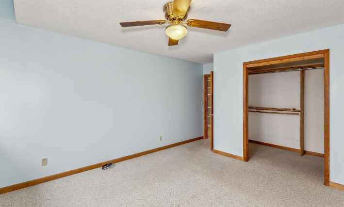
It’s boring, for the most part, which is a huge positive in this house. The closet appears huge, which is a little weird, and I do like the wooden trim.
Here is the bathroom:
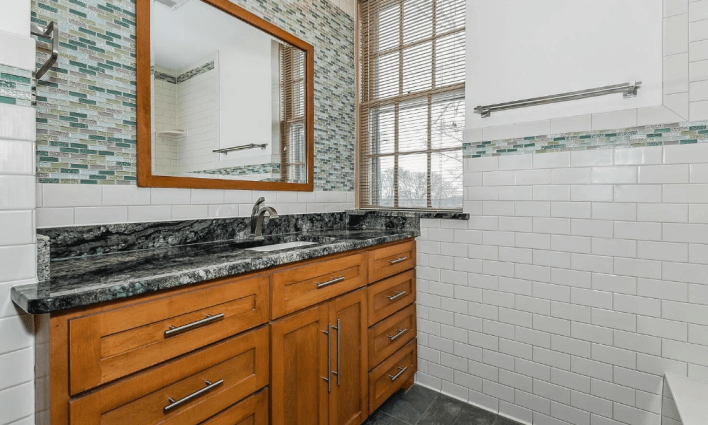
Now this, I do have some questions about. Shouldn’t a school, even what appears to be a small school, have more than one toilet? Did this used to be the teacher’s bathroom? If so, what happened to the other bathroom?
It is not quite big enough for me to believe that there used to be stalls in here that were renovated, which you would think would be the benefit of renovating a school. Schools have so much piping! Theoretically you could have a gigantic bathroom.
This bathroom, also, weirdly, seems to have gotten the landlord special. The subway tile looks fine, but the strange glass green tiles are straight from the Home Depot bargain pile. I don’t have a problem with that, but they don’t exactly vibe with the black counters and slate floor. I also feel like, if you are going to live in a renovated school, you should lean into the weirdness a little more, and for that reason I do like the horizontal stripe of glass tiles that goes around the wall. Wall stripes are a classic elementary school design choice.
Here’s another bedroom:
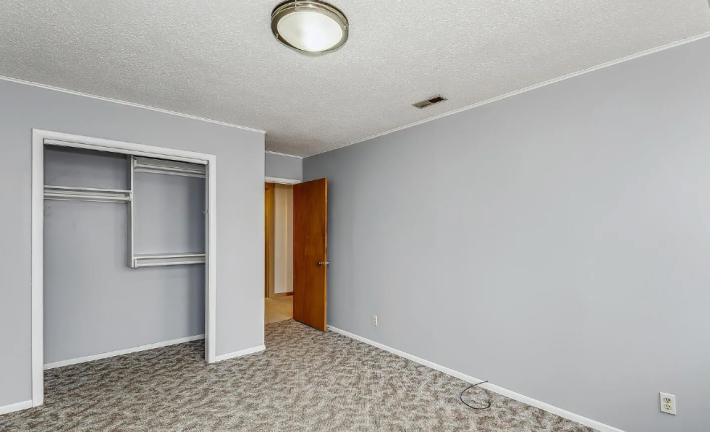
It’s weird that this bedroom has different carpet than the others, and that I have no ability to tell whether it is older carpet or newer carpet. It could be either. It could be from 1945 for all I know.
I don’t love carpet, and I think if you’re going to have it, it should be fluffy. This doesn’t look fluffy. This looks like it sucked up a bunch of goldfish crumbs in the 90s and has refused to given them back.
Back in the hallway, we find the one part of this house that I do really like, and it is these hallway shelves:
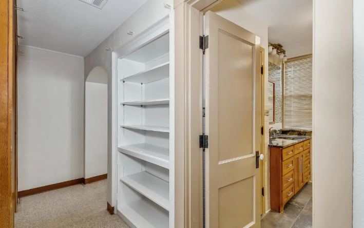
In every house, no matter how many strange handcuffs or weird stains or claustrophobic corridors, there is always something worthy of appreciation. I imagine us wallpapering the inside of this built-in, and putting little knick knacks in there, or just filling the whole thing with brightly colored books.
It is so easy to forget about a hallway, so I appreciate that this one is getting a little bit of attention.
I think I’ve seen enough to decide that I won’t be putting in an offer on this house. Let’s head back outside:
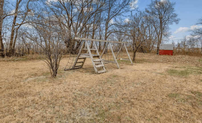
What a sad little playground. It doesn’t even have a slide!
I believe Sean when he says that he believes he could fix this house. I believe in his inspiration in the Kennedy School. I believe that with a little bit of love and a lot of passion almost any house can be made into a lovely and exciting home. And honestly, a little haunting is probably worth it if you could get this house anywhere close to its Zestimate. It’s rare these days to see a house under $100,000, even in the middle of nowhere. You could just tell yourself the sounds of crying and wailing were the wind whipping around the corner. It might work!
This week’s house has been listed on Zillow with its price unknown for 16 days. If you buy this house, please also budget for a power washer. You’re gonna need it.
#Mysteriously #Priced #House #Quitting #Jobs
